Mitchell’s laws: The more budgets are cut and taxes inceased, the weaker an economy becomes. Until the 99% understand the need for deficits, the 1% will rule. To survive long term, a monetarily non-sovereign government must have a positive balance of payments. Austerity = poverty and leads to civil disorder. Those, who do not understand the differences between Monetary Sovereignty and monetary non-sovereignty, do not understand economics.
==========================================================================================================================================
The following graph shows employment / population ratios.

While the percentage of Americans who are employed has changed very little since 1948 (red line — 57% in 1948; 58% in 2011), the change in the difference between men (blue line) and women (green line) is stunning.
Back in 1948, only 30% of women were employed. Today, more than half are employed. By contrast, 1948 saw more than 80% of men employed, compared with less than 65% today.
There are several reasons for this phenomenon, and at least one is rather sad: Lower salaries for women, make them more attractive hires.
Toward the end of the 1960’s, I worked in the advertising agency business. Back then, it was a male-dominated industry. Just ten years later, it had become female dominated, in terms of employee numbers (though not in job titles). The reason: For any given job, the agencies could hire a woman to do it as well as a man, but cheaper. Since advertising is heavy on personnel, the savings were enormous.
Ironically, the men, by keeping a lid on women’s salaries, did themselves a disservice. They created a competing class of worker, just as skilled, but costing less.
======================================================================================================================================================================================
Lest there is any doubt that a college education helps:

During recessions, college graduates seem less likely to be fired, and when the recession ends, the non-graduates must start from a comparatively worse position. I suspect, our increasingly high-tech economy will exacerbate this problem for those who don’t graduate college.
I have proposed, and continue to propose, that just as elementary and high school education is government supported, so should college education be financed by the government. For America to compete and grow in the global market, our young people increasingly need a college education.
Unfortunately, college has become so expensive, only the wealthiest children or those willing to suffer years of huge college debts, can attend. It is foolish and counterproductive to place such barriers in front of our future.
======================================================================================================================================================================================
Here is a graph that has me searching for answers.
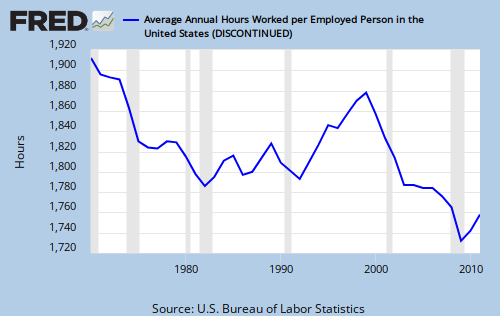
I’m not sure why hours-per-employee went down dramatically from 1970 through the mid 1980’s, then rose in the 1990’s, then crashed during the 2000’s.
I suspect it has to do with the development of computers in business. In the 1970’s, word processors were becoming popular, and in the 1980’s full-fledged computers became more common, especially with the advent of spread sheet programs.
The Internet began to take off in the 1990’s, and the 2000’s saw the rise of Google, followed by the social web pages.
And to all of this, I say, “So?”
Clearly, computers and the Internet have increased productivity, which translated into fewer hours needed to accomplish the same results. But the down – up – down shape of the graph is related to additional effects.
I can speculate that the growth in average hours earlier was related to business growth, but that around the year 2000, computers started to become so efficient that productivity increased faster than business growth, and fewer hours were needed.
There is a bare hint of that effect in the following graph, where the red line represents GDP growth multiplied by productivity. (Faster GDP growth sends the line down; faster productivity growth sends the line up.)
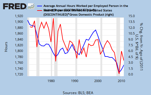
Obviously, any “correlation” is tenuous at best, since population growth, more women in the workforce, trade deficits, tax laws and several other factors may be involved.
Rodger Malcolm Mitchell
http://www.rodgermitchell.com
![]()
==========================================================================================================================================
No nation can tax itself into prosperity, nor grow without money growth. Monetary Sovereignty: Cutting federal deficits to grow the economy is like applying leeches to cure anemia. Two key equations in economics:
Federal Deficits – Net Imports = Net Private Savings
Gross Domestic Product = Federal Spending + Private Investment and Consumption + Net exports
#MONETARY SOVEREIGNTY

Not sure how seriously to take the “hours worked” stat ?
Do they count the hours worked by salaried employees, or merely assume that salaried employees work 40 hours ? Most employers don’t even keep track of how many hours salaried employees work, unless state law requires paying salaried employees overtime (my state does not, and private sector salaried employees are expected to work massive overtime without additional pay).
Regarding hours worked by hourly employees, I’d say that reflects the labor market. When business is booming and the labor market is tight, there is more overtime. When business is slow and there is a surplus of labor, there is less overtime.
Not sure that computers enter into the equation since hourly employees are less likely to work at a computer than salaried employees ?
Another trend that might figure into this is the use of temps and outsourcing work to contractors rather than having the work done by a full time employee. These temps and contractors do not have steady work, so their yearly hours may be less.
LikeLike
thanks be to you, rodger! i’ve been meaning to go out and look up stats like these and you just made my job a lot easier.
1st graph… you say that the change in employment btw. men and women is “stunning” and i totally agree, but, for me, the most stunning is the fact that for the past 60+ yrs., civilian employment has remained nearly constant at around 60%. we’ve heard so much about the boom in the 80s and 90s and the bust of the past few years, but, for all the talk, employment is still at the same level as it was 60 yrs. ago. it’s as if someone has been pushing a button to keep it around 60%… i just wonder–why 60?
one question–is there a “non-civilian” version of the 1st graph?
also, one thing that has always perplexed me–why are we always given the “unemployment” numbers? it seems to me that it’s impossible to know precisely how many people are unemployed. it just seems to make more sense to give out the no. of people employed as opposed to unemployed.
LikeLike
Kim, while it is technically true that the employment ratio has changed very little since 1948, in between in bounced around quite a bit. I was actually trying to make a point regarding the difference between men and women, so I may accidentally have misled you with the graph, which by necessity compressed the vertical measure (to make room for both sexes).
Believe it or not, this is what the graph looks like, alone. The numbers are the same, but the impression is quite different. Welcome to the magic of graphing.
Shows how graphs can be used to create a misleading picture.
LikeLike
Two things help to explain the drop in hours per employee over time: one is the increase in women as a % of the total workforce. They seem to have a better sense of work-life balance than men, and woman-dominated industries seem to be have more regular “9-to-5” sort of schedules, and less overtime. The other is the baby boom. During the time of the graph, baby boomers were in the work force and gaining seniority, and with that comes more vacation time. During the 1980’s and 1990’s hiring was strong, and the new hires had little vacation, thus worked more hours.
Both these trends have about run their course. From now on, women will no longer be a rapidly rising percentage of the workforce (and may be getting more like men in their work behaviors and career choices), and baby boomers with lots of vacation time will be retiring. When an economic recovery finally takes hold, hours worked should rise again.
LikeLike
Katrina vanden Heuvel recently wrote a column supporting free college: http://www.washingtonpost.com/opinions/free-college-we-can-afford-it/2012/05/01/gIQAeFeltT_story.html
It’s a good column, but it’s written on the false precept that affordability is something the federal government should sometimes consider.
LikeLike
Rodger,
As per your comment on women in the work force, you might find this background paper from Oxfam of interest – a href=”http://www.iiav.nl/epublications/2008/feminist_economics.pdf”>Feminist Economics
LikeLike